Search Input Tool
toolType: 'SearchInput'

Overview
The search input tool is an attractive and user-friendly utility that permits users to easily find availability for a client's services and then go to FareHarbor's booking Lightframe. The tool consists of the following components:
- The input fields:
- A dropdown menu listing a client's activities or events (such as "Snorkel Tour"), known as the activities dropdown;
- A second dropdown menu listing dates by month and year ("January 2017"), known as the date dropdown;
- The buttons:
- A main action button which activates the booking Lightframe, usually rendering a calendar of availability;
- And an optional additional details button to render a detailed profile and a mini-calendar of availability for a given activity.
Main Advantages:
- Increased conversions: the simple and user-friendly interface presents a no-hassle and intuitive way for users to easily view the client's availabilities and go to the booking Lightframe. Moreover, the margins position the tool in the center of the page, allowing for maximum visibility.
- Versatility: the integrator can customize many of the tool's elements, ranging from the button text to the functionality of the two input fields to background colors. To cite just one use case: the client requests a change in the background color of the buttons to match the company color scheme. This only requires a simple change in one or two properties of the tool as detailed below.
- Ease of implementation: By following this guide, the integrator can easily apply properties such as background color requested by the client without needing a deep understanding of the underlying code.
- Responsive: On load, the layout of the tool automatically adjusts for smaller screens, like smartphones and tablets. The integrator can also customize the layout on larger screens between two options: horizontal and vertical.
- Lightweight: The tool boasts simplicity, low memory cost, and excellent performance. It only makes a single API call when loaded and then links to the Lightframes using simple
atags.
As noted above, the tool is highly customizable for the client. See full details in the following sections.
The tool can be used in any major browser. It's all vanilla JavaScript under the hood, and it's lean, adaptable, and ideal for the client, user, and integrator.
Before Proceeding Further:
Please make sure you have read and followed the setup steps in the Introduction.
How To Use:
In order to use the tool, there are several requirements.
[consider bundling the scripts so they only need to load one]
- Lightframe API (ensure
?autolightframe=yesis included) - Add FHConfig.js (
<script src="FHConfig.js"></script>).- Note: the path will likely be different based on the FareHarbor file structure.
- Add FHToolCreator.js (
<script src="FHToolCreator.js"></script>)- Note: the path will likely be different based on the FareHarbor file structure.
- Add FHSearchInput.js (
<script src="FHSearchInput.js"></script>)- Note: the path will likely be different based on the FareHarbor file structure.
- Add FHSearchInputStyles.js (
<script src="FHSearchInputStyles.js"></script>)- Note: the path will likely be different based on the FareHarbor file structure.
- If you want to use FareHarbor's defined styles, ensure the FareHarbor stylesheet is linked. Please note, however, this is not necessary to use the tool.
- As a final requirement, you need to edit the
FHConfig.jsto edit the text, colors, and Lightframe endpoints. This is covered below.
Getting Started:
The config and searchInput objects
FHConfig.js
FHConfig.js

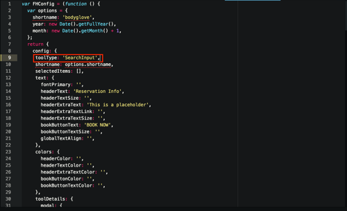
All of the customizable properties for the Search Input tool, along with the other tools in the Toolkit, are contained in a single configuration object, entitled config, which is contained in the FHConfig.js file. (It is the object returned by the var FHConfig.) To display the Search Input tool, the integrator must change the value of the toolType property within this object to SearchInput. (See the top screenshot.)
Next, if the integrator has not done so already, he or she should remember to change the config object's shortname key to the shortname for the desired company. (See the introduction for more on this).
Within this config object, the properties for each type of tool in the Toolkit are organized as top-level keys within the toolDetails object. All of the properties pertaining to the search input tool live in the searchInput object within toolDetails(except for the shortname and selectedItems keys). The searchInput object is in turn broken into four top-level keys:
searchInputContainer(See The Container below)stackOrientation(See Stack Orientation below)inputFields(See Input Fields below)buttons(See Buttons below)
The first two keys refer to simple element-agnostic properties that will be detailed below, while the latter two refer specifically to the tool's input fields and buttons. To change a given property's value, the integrator will need to go inside the searchInput object and then to the relevant nested property-value pair (for example, in order to make the background color of the main action button red, the integrator would go inside the searchInput object to the buttons key, then to the buttonsBackgroundColor object, and finally to the goButtonBackgroundColor key, which in this example would be given a value of #ff0000).
The Input Fields: Overview
As noted in the introduction, the two input fields are both dropdown menus that enable the user to easily select from lists of client activities and dates. For instance, a user could select "Jungle Tour" for "March 2017." The dropdown interface was chosen due to its ease of use and widespread user familiarity. As noted at the bottom of this section, the user does not have to select a value from either field for the booking Lightframe to activate. The more information they give, though, the more specific the booking Lightframe will be.
As discussed further below, the elements of the input fields that the integrator can customize are:
- The specific activities populated in the activities dropdown (i.e. "Day Hike", "Surfing Lesson");
- The dropdown menus' layout on the page (horizontal versus vertical)
- The functionality of each input field (activity display and selection versus date display and selection)
- The input fields' background color and default text
- Their borders
The Buttons: Overview
Calendar Lightframe:

Profile Lightframe:

Two buttons--a required main action button and an optional additional details button--are included in this tool. They activate the booking Lightframe, but in different ways. The main action button takes the user to a Lightframe that is calendar-based (unless neither input field has a selection, in which case a photo grid of all client activities appears). The additional details button, by contrast, displays a detailed profile of the selected activity with a small calendar of availability on the left (the details button is disabled if no activity is selected). See the screenshots above for more details.
The elements of the buttons that the integrator can customize are:
- Their layout on the page
- Their background color and text
- Whether a details button exists
- Their borders
- Their height and width
Both the input fields and the buttons have default properties that the integrator can override via the config object. If any values in the searchInput object are left blank by the integrator, then the search input tool renders with the default value (with a few exceptions as noted below).
What Happens If The User Leaves a Field Blank?
If a user leaves one or both input fields unselected (i.e. the default text appears, rather than an activity or date option), the buttons activate different Lightframes depending on the input fields' state. The following grid illustrates all possible cases:
For the main action button:
| Activities Dropdown State | Date Dropdown State | What Does the Button Do? |
|---|---|---|
| Activity selected ("Fishing Excursion") | Date selected ("March 2017") | Opens a booking calendar based on the selected activity and selected date |
| No activity selected (default text such as "Which Event?" displays) | Date selected ("March 2017") | Opens a booking calendar based on the selected date, but showing all activities for the client |
| Activity selected ("Fishing Excursion") | No date selected (default text such as "When?" displays) | Opens a booking calendar based on the selected activity and showing the current month |
| No activity selected (default text such as "Which Event?" displays) | No date selected (default text such as "When?" displays) | Opens a photo grid of all client activities, which the user can toggle to a calendar using a button |
For the additional details button:
| Activities Dropdown State | Date Dropdown State | What Does the Button Do? |
|---|---|---|
| Activity selected ("Fishing Excursion") | Date selected ("March 2017") | Shows detailed profile of the selected activity with mini-booking calendar |
| No activity selected (default text such as "Which Event?" displays) | Date selected ("March 2017") | Nothing (it is disabled if no activity is selected) |
| Activity selected ("Fishing Excursion") | No date selected (default text such as "When?" displays) | Shows detailed profile of the selected activity with mini-booking calendar |
| No activity selected (default text such as "Which Event?" displays) | No date selected (default text such as "When?" displays) | Nothing (it is disabled if no activity is selected) |
The Container
The container wraps the entire search input tool and positions it on the page by centering it horizontally and vertically.
The container possesses a single customizable property, borderDebug. Set to false by default, this property displays a dotted red border around the container. The purpose of borderDebug is to allow the integrator to easily see the boundaries of the container for debugging purposes.
To modify this property, the integrator should go to the borderDebug key within the searchInputContainer object and toggle between true and false. These two booleans are the only accepted values for this property (unlike most other properties, it cannot be left blank).
Stack Orientation
Horizontal view:

Vertical view:

Mobile view:

Stack Orientation refers to whether the search input tool displays in a horizontal layout, as in traditional desktop design, or conversely whether it displays as a vertical "stack", as is common for mobile sites and applications. See the screenshots above.
There are two possible options that the integrator can set for this property: horizontal or vertical. To modify this property, the integrator should look within the main searchInput object, which has a stackOrientation property. The integrator should then simply set the property for this value to either horizontal or vertical. No other values (other than an empty string, which triggers the default value) are accepted.
Regardless of this specification, the layout of the tool automatically loads as a mobile-friendly vertical layout when the screen width is less than 700px. The default is a horizontal view on screens above this size.
The Input Fields
Selecting Specific Activities to Display:
FHConfig.js
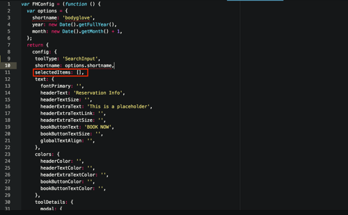
The integrator can choose whether the activities dropdown displays all activities for a particular client or only a selection of activities. The default is to show all activities, but this can easily be changed. To do so, go to the selectedItems property of the main config object (not inside searchInput, because this property is relevant for other tools) and add the PKs for the desired activities within the empty array. This will cause the activities dropdown to only populate with the selected activities.
inputFieldTypes:
In which order does the client wish to display the activities dropdown and date dropdown--activities in the left input field and dates in the right, or vice-versa? This property allows the integrator to specify this. There are two possible options for the right and left input fields: eventPicker and datePicker. The eventPicker, as one might guess, tells the field in question to display activities, while the datePicker shows dates by month and year. Each input field must be either a datePicker or an eventPicker, and both cannot be of the same type. The default is eventPicker for the lefthand input field and datePicker for the right.
To change these properties: in the inputFields object within searchInput, look inside the inputFieldTypes object. Simply add the chosen value--eventPicker or datePicker--to the leftInputFieldFunction and rightInputFieldFunction properties. No other values (other than an empty string, which triggers the default value) are accepted.
leftInputFieldBackgroundColorandrightInputFieldBackgroundColor:
This allows the integrator to select a background color of any accepted color value for the right input field and left input field. To change these properties: within the inputFields object, go to the inputFieldBackgroundColor object and assign the relevant values to the leftInputFieldBackgroundColor and rightInputFieldBackgroundColor keys. The integrator can choose a word color ("blue"), a hex color (#0000ff), an RGB color, or any other color value accepted by modern browsers.
The default is white (#ffffff) for both input fields.
inputFieldText:
With this property, the integrator can specify the text that displays in both of the input fields by default (i.e. when no other value is selected.) The default settings for this are "Which Event?" and "When?" for the activities dropdown and date dropdown respectively.
To change this text: within the inputFields object, go to the inputFieldText object and add the new values to the leftInputFieldTextContent and rightInputFieldTextContent. The new values can be any string.
Three other sets of properties are also customizable within the inputFieldText object:
leftInputFieldTextColorandrightInputFieldTextColor(default for both:black(#000000))leftInputFieldTextFontNameandrightInputFieldTextFontName(default for both:Lucida-Grande, Verdana, sans-serif;)leftInputFieldTextFontSizeandrightInputFieldTextFontSize(default for both:22px)
inputFieldBorders:
This allows the integrator to specify the colors for the top, right, bottom, and left borders for each input field. Within the inputFieldBorders object, each of the following properties can take any valid color value:
leftInputFieldBorderBottomColor
leftInputFieldBorderTopColor
leftInputFieldBorderRightColor
leftInputFieldBorderLeftColor
rightInputFieldBorderBottomColor
rightInputFieldBorderTopColor
rightInputFieldBorderRightColor
rightInputFieldBorderLeftColor
The default for all is a medium-gray (#979797).
The Buttons
buttonsBackgroundColor:
This allows the client to choose background colors for the main action button and additional details button. As with the input field background color, the integrator can choose any accepted color value. To change these properties: within the buttons object in searchInput, go to the buttonsBackgroundColor object and assign the relevant values to the goButtonBackgroundColor and detailsButtonBackgroundColor keys.
The default is a medium blue (#3d89df) for both buttons.
goButtonBackgroundColorHoveranddetailsButtonBackgroundColorHover:
The same as above, except this property refers to the hover state (when the user has the mouse over the button but is not actually clicking on it). These properties are contained in the goButtonBackgroundColorHover and detailsButtonBackgroundColorHover properties within the same buttonsBackgroundColor object.
The default for both is a lighter blue (#88BCF8) than the regular background color.
buttonsText:
As with the input fields, the integrator can select the text content and other related properties for each button. Within the buttonsText object (which is inside the buttons object), the integrator can specify the following:
goButtonTextContentanddetailsButtonTextContent(default for the former is "Go!" and for the latter is "Full event details". Values must be strings.)goButtonTextColoranddetailsButtonTextColor(default for both:black(#000000))goButtonTextFontNameanddetailsButtonTextFontName(default for both:Lucida-Grande, Verdana, sans-serif)goButtonTextFontSizeanddetailsButtonTextFontSize(default for both:25px)
doesDetailsButtonExist:
This property simply determines whether or not the additional details button exists for a given implementation of the tool. The integrator change change the value for this property, called doesDetailsButtonExist, within the buttons object. Default is true. The two booleans, true or false, are the only accepted values for this property (unlike most other properties, it cannot be left blank).
buttonsBorders:
The same as the input field border options, except for the buttons. Within the buttonsBorders object, each of the following properties can take any valid color value:
goButtonBorderBottomColor
goButtonBorderTopColor
goButtonBorderRightColor
goButtonBorderLeftColor
detailsButtonBorderBottomColor
detailsButtonBorderTopColor
detailsButtonBorderRightColor
detailsButtonBorderLeftColor
The default for all is a light blue (#8cc0fb).
FAQs:
- So, what is this tool really for?
- It allows the client site's user to easily select a client activity and a date and then be taken to the booking Lightframe.
- What are the main advantages of this tool?
- It's a simple, intuitive, and user-friendly way to get users to the booking portion of a client's site quickly. It consists of two clearly-labeled dropdown menus and one or two buttons that show booking information. Virtually all users are familiar with dropdown menus and buttons, so any user can easily make use of this tool. This tool will effectively allow users to quickly go to the booking system and thus increase conversions.
Can the integrator change the color scheme of the tool to match a client's colors?
- Absolutely! The integrator can easily customize the color scheme of the tool, as well as many more properties. See above for more details.
Can the integrator change the order that the activities and date dropdowns appear on the screen?
- For sure! See
inputFieldTypesabove.
- For sure! See
Can the integrator choose which client activities/events display in the activities dropdown?
- Yes! See Selecting Specific Activities to Display above.
Can the integrator choose functions other than a date dropdown or an activities dropdown for the input fields?
- No, the tool only allows these two functions for the input fields.
What happens if a user leaves one of the input fields unselected and then presses the main action button?
Is this tool responsive?
- Yep! When the user's browser window is less than
700pxwide, the tool's layout automatically switches to a mobile-friendly "vertical stack" orientation. (Smaller tablets and all smartphones have screens less than700pxwide.) Additionally, the client can choose whether the tool's layout is vertical or horizontal on larger screens. For more details, see Stack Orientation.
- Yep! When the user's browser window is less than
So, what happens if I leave a value blank in the
searchInputobject?- If a value for a customizable property such as
leftInputFieldBackgroundColoris left blank, then the search input tool will render the default value for this property (in this case,#ffffff).
- If a value for a customizable property such as
Who can I reach out to if I have additional questions?
- If you have further questions, please reach out to Adam Hundley (FareHarbor dev team). He has my contact information and will reach me if need be.