Footer Tool
toolType: 'Footer'

Overview
The footer tool is a simple but effective customizable utility that attracts the user to one to four booking links (also referred to in this document as text nodes or elements). These links then go to FareHarbor's booking Lightframe or to other links specified by the integrator.
The tool consists of the link(s) set against a simple background (default of light blue, #88bcf8). As detailed further below, the integrator determines how many links to display (one to four), and the footer then automatically positions the links accordingly.
Main Advantages:
- Increased conversions: the layout draws attention to the first link, which in most cases would be "Book Now!" or something similar. It's free of mystery and hassle for the user, allowing them to easily click on the links.
- Ease of maintenance: the tool's simplicity also means that it is very easy to maintain. With few moving parts and the (easily-interchanged) links stored in simple
atags, the footer can easily be applied to a wide variety of client sites. - Versatility: the number of links is not the only customizable element for the tool. The integrator can also change properties such as the footer's background color and the text of the links. One possible use case might be specifying three links in Arial font and a light red background to match a client site's overall design scheme and booking strategy.
- Responsive: On load, the layout of the tool automatically adjusts for smaller screens, like smartphones and tablets.
As noted above, the tool is highly customizable for the client. See full details in the following sections.
The tool can be used in any major browser. It's all vanilla JavaScript under the hood, and it's lean, adaptable, and ideal for the client, user, and integrator.
Before Proceeding Further:
Please make sure you have read and followed the setup steps in the Introduction.
How To Use:
In order to use the tool, there are several requirements.
[consider bundling the scripts so they only need to load one]
- Lightframe API (ensure
?autolightframe=yesis included) - Add FHConfig.js (
<script src="FHConfig.js"></script>).- Note: the path will likely be different based on the FareHarbor file structure.
- Add FHToolCreator.js (
<script src="FHToolCreator.js"></script>)- Note: the path will likely be different based on the FareHarbor file structure.
- Add FHFooter.js (
<script src="FHFooter.js"></script>)- Note: the path will likely be different based on the FareHarbor file structure.
- Add FHFooterStyles.js
(<script src="FHFooterStyles.js"></script>)- Note: the path will likely be different based on the FareHabor file structure.
- If you want to use FareHarbor's defined styles, ensure the FareHarbor stylesheet is linked. Please note, however, this is not necessary to use the tool.
- As a final requirement, you need to edit the
FHConfig.jsto edit the text, colors, and Lightframe endpoints. This is covered below.
Getting Started:
The config and footer objects
FHConfig.js

FHConfig.js

All of the customizable properties for the footer tool, along with the other tools in the Toolkit, are contained in a single configuration object, entitled config, which is contained in the FHConfig.js file. (It is the object returned by the var FHConfig.) To display the footer tool, the integrator must change the value of the toolType property within this object to Footer. (See the top screenshot.)
Next, if the integrator has not done so already, he or she should remember to change the config object's shortname key to the shortname for the desired company. (See the introduction for more on this).
Within this config object, the properties for each type of tool in the Toolkit are organized as top-level keys within the toolDetails object. All of the properties pertaining to the footer tool live in the footer object within toolDetails(except for the shortnamekey).
This footer object contains several keys which refer to either primitive values, such as strings, or child objects with their own properties and values. These keys, and their corresponding values, are what enable the integrator to customize the footer: as explained below, to change an aspect of the footer such as its background color, the integrator would find the corresponding key (footerBackgroundColor in this case) and change its value to the desired specification (in this case, perhaps#ff0000 for red). For keys containing child objects, the integrator will need to go inside these objects and then follow the same process of changing the value(s) for the relevant key(s).
If any values in the footer object are left blank by the integrator, then the footer tool renders with default values (with a few exceptions as noted below). Each section below covers a particular top-level key in the footer object and the options for customization within.
isFooterSticky:
This property allows the integrator to make the footer "sticky," which means that it has a fixed position on the bottom of the page. This is convenient of the client wishes to increase bookings by making the footer always visible to the user on the page. If the integrator chooses true for this property, then the footer will automatically be positioned at the bottom of the page and remain there even when the user scrolls. If the value for this is instead set to false, then the footer will fall into the normal page flow. The default is true, and the only accepted values are the boolean values of true and false.
footerBackgroundColor:
The background color for the footer. For this property, the integrator can select any color value accepted by modern browsers, such as a recognized word ("blue"), a hex color (#0000ff), or an RGB color. The default is a light blue (#88bcf8).
footerBorders:
This key contains a child object with four keys: footerBorderBottomColor, footerBorderTopColor, footerBorderRightColor, and footerBorderLeftColor. Each of these can accept any valid color value. The default for all is the same as the default footer background color, #88bcf8.
elementHoverColor:
This is the color that a text node (each element) takes on when the user hovers their mouse over it. As with the above, this can accept any valid color value. The default is a silverish gray, or #888888.
elements:
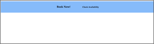
With four elements (desktop view):
With three elements (desktop view):

With two elements (desktop view):
With one element (desktop view):

These are the actual links, or text nodes, that show up in the footer. The value for this key in the footer object is an array of four objects, each of which represents one of the elements in the footer. Each of these element objects contains the following customizable properties:
doesItExist: should this element render? As noted above, the integrator can specify one or four elements for the footer tool. The objects in theelementsarray, from top to bottom, correspond to the left-right order of rendering (or the top-bottom order if the screen is below700px). In other words, the topmost element object renders leftmost in the footer on a standard desktop screen, while the bottommost element object renders rightmost. The topmost element object thus must always exist, and thus its value must always be kept astrue, but the value of thedoesItExistkey can be toggled tofalsefor the other three if desired. ThedoesItExistkey can only accept the boolean values oftrueorfalse,and it cannot be left blank. Based on these specifications, the footer automatically formats to include one, two, three, or four elements (see screenshots above). The default istruefor all four elements.- Note: the elements have built-in
idsof "first" through "fourth" based on their rendering order above. Due to the way the code for the footer tool is written, elements that do not exist (doesItExist: false) cannot be ordered before existing elements (doesItExist: true). (For instance, the element withidof"second"cannot be falsy if the element withidof"fourth"is truthy.)
- Note: the elements have built-in
id: The integrator should not change this. This is a hard-coded value used to style the elements in theFHFooter.jsfile.textContent: What should the element's text actually say? The leftmost or topmost element should probably say something like "Book Now!", but the others depend on the needs of the client. This value can be any string.linkTo:The link wrapping the text node. Each existing element must have a link, which can either be a FareHarbor Lightframe (as the first two are by default) or another location.color: The text color in the given element. Any valid color value is accepted; the default for all is black (#000000).fontName: The font used in the element. Default for all isLucida-Grande, Verdana, sans-serif.fontSize: How big does the integrator want the font to be for an element? Default for the first element is22px, because it should stand out from the rest. The default for the others is16px.fontWeight: The weight of the text; how much it should stand out. Default isbolderfor the first element andnormalfor the rest.
Responsiveness:
Mobile view (four elements shown):

The layout of the footer tool changes depending on the screen size. In screens larger than 700px wide, the layout is horizontal, while in screens below that width, the layout is a more mobile-friendly vertical "stack".
FAQs:
- So, what is this tool really for?
- It is a simple yet effective footer that allows the user to easily click on a link and be taken to FareHarbor booking Lightframe or another location. It aims to complement the other booking tools on a site.
- What are the main advantages of this tool?
- It is simple, intuitive, and light-weight. It consists of a logically-organized and user-friendly layout that any user will understand, and it also highlights the first "Book Now!" button to help increase conversions.
Do all the text nodes in the footer need to contain links?
- Yes. The tool was designed to show the user a few easy-to-find links to increase conversion, so each text node must include a link to something, either a FareHarbor Lightframe or another location.
So, what happens if I leave a value blank in the
footerobject?- If a value for a customizable property such as
footerBackgroundColoris left blank, then the footer tool will render the default value for this property (in this case,#88bcf8).
- If a value for a customizable property such as
How customizable is this footer tool?
- Very! See the sections starting with
footerBackgroundColorabove.
- Very! See the sections starting with
Do I need to format the margins and padding of the footer or its links?
- No. These values are automatically computed based on the number of links in the footer and the screen size.
Is the tool responsive?
- Yes. See Responsiveness above.
Who can I reach out to if I have additional questions?
- If you have further questions, please reach out to Adam Hundley (FareHarbor dev team). He has my contact information and will reach me if need be.